
Designing a responsive web app for property and land investors
Livelihood
Role: UI Design
Reading Time: 5 mins
TO READ MORE
Overview
Livelihood, formerly Perfect Properties, was one of four projects available as part of the UI specialisation at Career Foundry. Taking on this challenge pushed me to enhance my skills and deliverables as a UI designer.
Team: Individual
Tools: Figma, Usability Hub, Word Tune, Pen and Paper
Objective
Create a mobile-first responsive web app that provides new, small-scale property buyers with information on potential property and land investments.
Challenge
Real estate investment is an increasingly popular way for individuals to achieve financial security. It is an exciting and emotional experience, but often complicated. While there are plenty of blogs and agencies providing information, often, buyers new to the market may struggle to get started without professional guidance and waste time viewing properties out of their range. This web app will provide them with the expertise needed to get started efficiently.
Research
In my role as UI Designer, the research was not within my scope and had already been completed. The research insights and models were delivered to me including a persona, user stories and feature requirements. I created a visual representation of this information to refer back to during the design process.
User Persona

User Stories | Flow Diagram
User Story #1
“As a user, I want to be able to search and filter properties, so that I can find good matches based on my needs.”
User Story #2
“As a user, I want to create a profile containing all my property criteria, so that I am recommended results most relevant to me.”
User Story #3
“As a user, I want to be able to save or mark properties I am interested in so that I can easily revisit them.”
Ideate
Low Fidelity
My first step of the process involved sketching low-fidelity wireframes to conceptualise the functions of the application established by the persona and user flows, before adding more details and time.

Mid Fidelity

After establishing the key functionalities, I created Mid-Fidelities to add copy, details to UI elements and design principles, and ideate on responsive breakpoints and grid layout.
Search and filter content

Selected Mood Board
This look reflects some of the tones and values of the project brief and foundational research, which will give direction to the visual design of the application moving onto high fidelities. It was heavily influenced by the use of colour theory and the ability to influence emotions and mental and physical interaction costs. The complementary colour palette of this look solves the problem of contrast, indicating action and selection, improving user interaction and navigation.


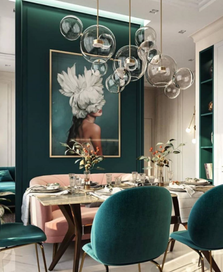


In colour psychology, green evokes feelings of abundance and is associated with rest and security. As a result, we are suggesting to users an abundance of content but a place to retreat between house viewings. Complimentary to this, Purple combines the calm stability of blue with the fierce energy of red. Which gives users the energy to continue with their search which will improve our success metrics.
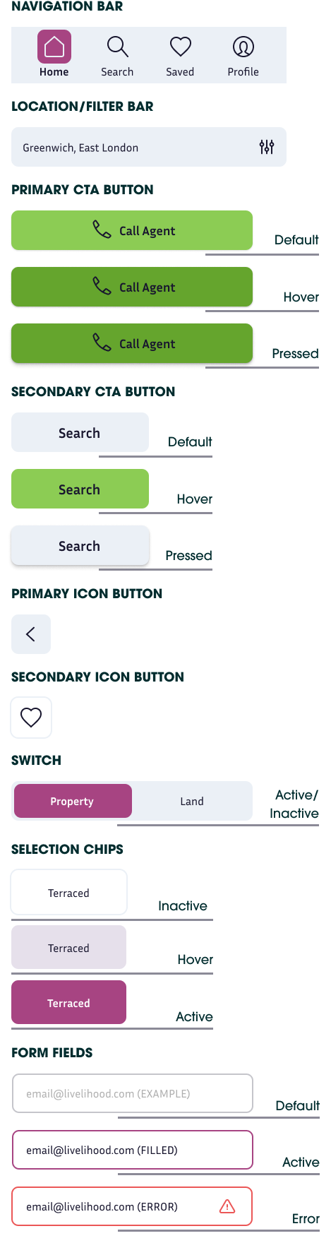
Design System
UI Elements
Logo

Typography

Icon Set

Imagery

Colour Palette

Grids
MOBILE: Column: 4 | Margin: 24px | Gutter: 16
TABLET: Column: 8 | Margin: 32px | Gutter: 16px
DESKTOP: Column: 12 | Margin: 64px | Gutter: 16px

Delivery
Final Mockups
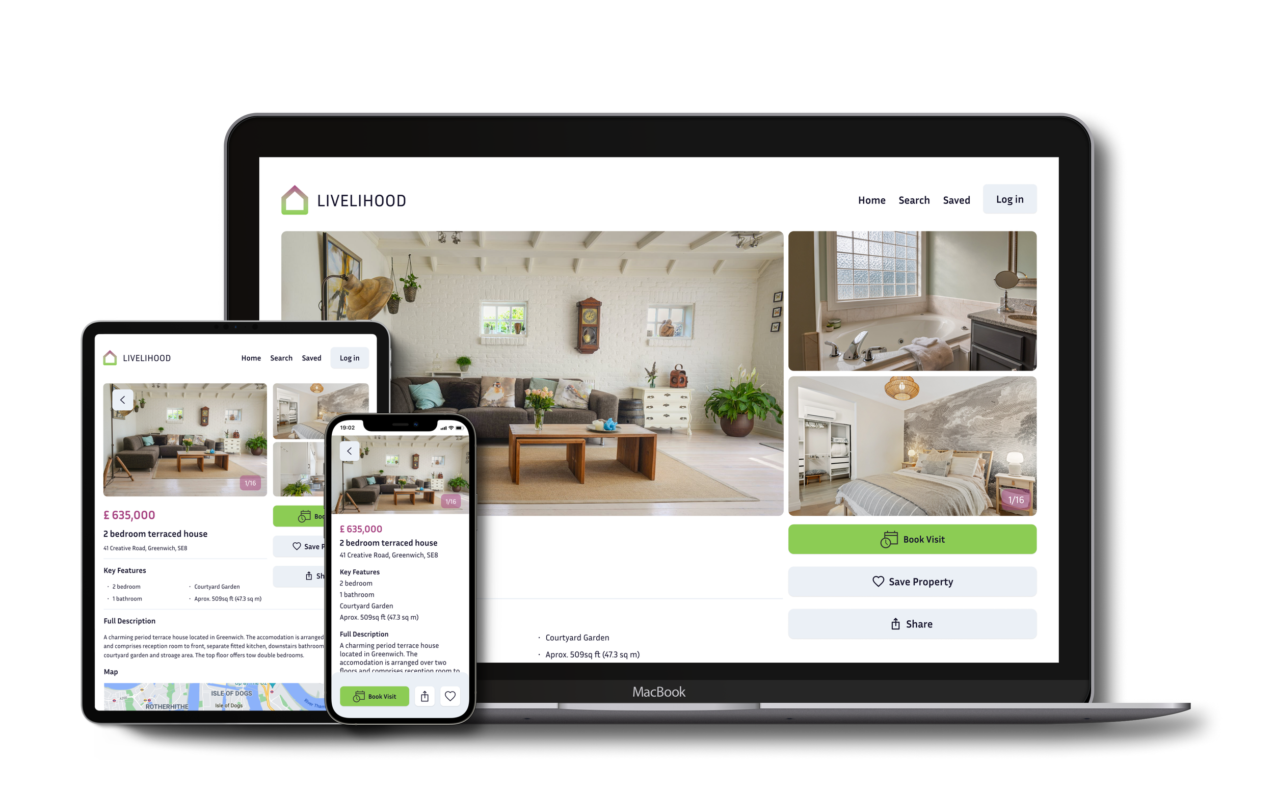
Search and Filter
“As a user, I want to be able to search and filter properties, so that I can find good matches based on my needs.

Save Search
“As a user, I want to create a profile containing all my property criteria, so that I am recommended results most relevant to me.”

Save Property
“As a user, I want to be able to save or mark properties I am interested in so that I can easily revisit them.”

Responsive Design

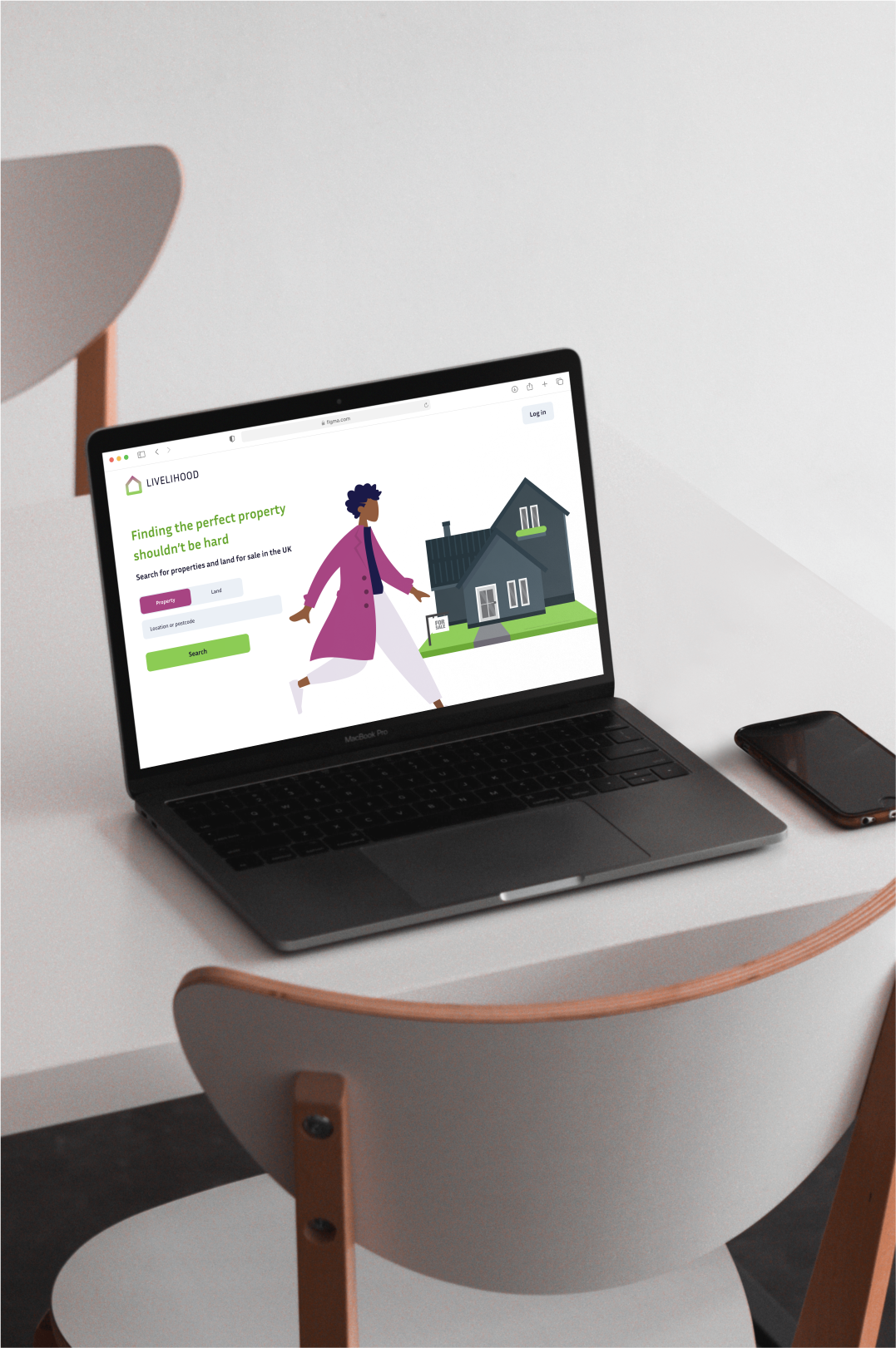
Finding the perfect property shouldn’t be hard


Livelihood Prototype
Reflection
This UI project was a very rewarding process for me, being able to work extensively on ideation, visual design languages and UI patterns. Reflecting on this project, I will continue to refine my user interface skills with daily UI design challenges and continue to develop my UI motion capability and integrate it into my projects.
The next steps for this project would be to validate the designs by conducting usability tests and iterating on all breakpoints in response to user insights and pain points.
Want to know more?
If you have questions or would like to talk about my experiences, please reach out i’m always happy to talk about my work and any opportunities.